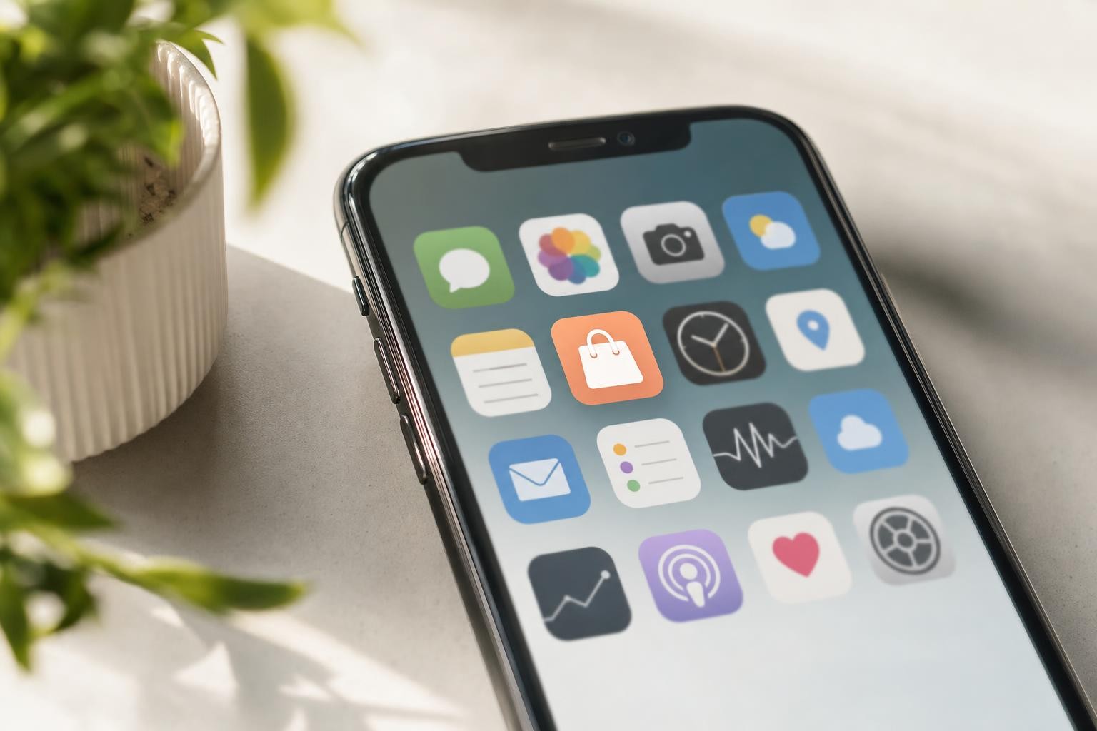
Most shoppers do not open your brand because they typed your URL. They open what sits on the home screen. Messaging. Banking. Delivery. Music. The brands that win repeat mobile revenue look like those apps, not like another tab in Chrome.
That is home screen commerce. A permanent icon. One tap back into the store. No search, no ad click, no “which tab was the jacket in?” If you run a catalog on Shopify, WooCommerce, PrestaShop, or Magento and 70%+ of sessions already hit phones, this is the retention surface you are missing on the mobile web.
This piece is for operators who feel stuck renting attention. We will cover why icons beat tabs, what changes in reopen and lifetime value, and how a managed native ecommerce app turns that into a weekly habit instead of a one-off download vanity metric.
The home screen is owned media. The browser tab is not.
A mobile tab is temporary real estate. The OS kills it. The user clears it. Another brand’s paid social pulls focus. Your merchandising dies with the process.
An app icon is different:
It stays put until the shopper deletes it. That is rare once the app is useful.
It trains a thumb path. Open bank. Open chat. Open your store. Habit compounds without another click to your domain.
It carries brand marks every unlocked phone session, even when the user is not shopping. That is free branded presence your SEM budget cannot buy at the same frequency.
You still need SEO and ads to acquire. Home screen commerce changes what happens after the first order, when CAC should fall and LTV should rise.
Why mobile tabs lose the retention fight
Responsive sites did their job. They made the catalog reachable on small screens. They did not solve return visits.
Discovery dies when the session dies
On the mobile web, product discovery lives inside a fragile session. Scroll depth is short. Interruptions are constant. When the shopper leaves, you are back to email (often under 5% useful reach on cold or semi-cold slices) or another paid impression.
There is no reliable “reopen” gesture
Bookmarks are weak. Progressive web app install prompts convert poorly for most fashion and beauty catalogs. “Add to home screen” still feels like a developer feature, not a shopping habit. Native install from the App Store or Google Play is the behavior people already know.
You pay rent on every comeback
If the only dependable paths back are Google Shopping, Meta, and email, your margin is permanently tied to auction prices. A home-screen icon plus push is how brands stop rebuying the same buyer every cycle. We typically see reactivation cost drop around 20% when CRM and push are wired into the app properly.
For the channel playbook that feeds revisits after install, see our guide to ecommerce push notification strategies.
What “home screen commerce” changes in the numbers
Downloads are a vanity line in a board deck. Watch these instead.
Reopen rate and session depth
Native sessions last longer. In our base we see roughly 10x time spent versus comparable responsive visits. Longer sessions mean more SKUs seen, more wish list adds, more chance the cart fills without a discount code hammer.
Lifetime value, not first order
In-app buyers showing up in our cohorts land near $85 LTV versus about $30 on responsive mobile (about 2.8x). That gap is habit plus easier repurchase plus push that actually gets read, not a magic checkout button.
Push as the lock-screen aisle
Open rates around 45% (about 7x typical email) turn the lock screen into a merchandising surface. Back-in-stock, price drop, order status, VIP early access. The icon is the storefront. Push is the window display that pulls the thumb.
Conversion on the path you control
When entry, browse, and checkout live in one native shell, friction drops. Brands we ship for often land near +34% conversion versus their prior mobile web baseline after the path is rebuilt for thumbs. Biometrics, wallets, persistent cart, bottom nav. Boring details. They compound.
Icon vs tab: a practical comparison for ecommerce directors
Entry — Tab: type, search, or ad. Icon: one tap from the grid the user already lives in.
Identity — Tab: cookies, password walls, 69%-class login friction when you force accounts early. Icon: OS-level auth and saved profiles.
Recontact — Tab: email, SMS, retargeting. Icon: push + in-app inbox on top of those channels.
Brand presence — Tab: none between visits. Icon: daily visual real estate next to apps people trust.
Dependency on auctions — Tab: high. Icon: lower share of return visits need a paid click.
None of this means you kill the website. The site still carries SEO, desktop, and first-touch research. The app becomes the preferred container for people who already chose you once.
How habit actually forms (and how brands break it)
Habit is not a splash screen that screams “ENABLE NOTIFICATIONS.” It is a short loop the shopper repeats without thinking.
Useful first open. Catalog sync, search that works, prices and stock they can trust. If day-one feels like a thin WebView, the icon gets buried in a folder.
A reason to return in week one. Order tracking, a wishlist with real alerts, a restock on something they viewed. One clear win beats five generic blasts.
Push that respects attention. Frequency caps. Segments. Silent hours. The 45% open rate only holds if you do not train people to swipe you away.
Checkout that feels like other apps they pay in. Apple Pay, Google Pay, stored addresses. End the safari through popup forms.
Kill the loop with spam, broken deep links, or a three-month release cycle for simple merchandising changes. That is why “we shipped an app in 2022 and forgot it” shows up as dead weight in analytics.
Cutting the SEO and SEM leash without going dark
Home screen commerce is not an excuse to stop acquiring. It is how you stop paying full price for every repurchase.
A sane mix looks like this:
Paid and organic still fill the top of the funnel and feed install campaigns when you choose to run them.
Post-install, a growing slice of revenue should show as direct / app open in your attribution, with higher repeat rate.
CRM shifts budget from “blast the file” to lifecycle in push and in-app, with email as backup rather than the only pipe.
If six months after launch almost all app revenue still starts with a paid click, you do not have a home-screen business. You have a paid webview with a badge. Fix onboarding and lifecycle before you scale install ads.
When an app icon is worth it for your brand
Move when most of this is true:
Mobile is already the bulk of traffic.
Mobile CVR lags desktop after basic UX fixes.
Repeat purchase and reactivation costs keep climbing.
Email and SMS cannot carry the CRM load alone.
Your stack is stable enough to sync (Shopify, WooCommerce, PrestaShop, Magento).
Wait if you are still finding product-market fit, or mobile is a rounding error. An icon on a weak offer is just a prettier way to churn.
How you ship matters too. DIY builders put design, store review, and roadmap on your team. A fully managed subscription keeps merchandising and growth on your side of the table while someone else runs native delivery. ConvertNative is built for that second path: design, deployment, store submission, and ongoing optimization, usually 4–6 weeks to production, no long-term lock-in theater.
Proof at scale sits with retailers like Notino (7M downloads class of proof point) and the rest of the stories on our customer cases.
A one-week check before you commit roadmap
Split revenue and orders by device for 90 days. Note repeat rate on mobile web alone.
Measure what share of returning buyers needed a paid click or email in the last 30 days.
Audit your last ten CRM sends. Open and revenue. Be honest about reach.
List the three post-purchase moments you wish you could trigger on a lock screen tomorrow.
If you cannot reach high-intent people in under 24 hours without buying the auction again, the tab model is capping you.
What ConvertNative puts on the home screen
We deliver a fully managed native iOS and Android app on subscription. Catalog and checkout stay tied to your ecommerce platform. You get targeted push, retention flows, and 360° analytics so product and CRM look at the same mobile story.
Operationally that means:
UI aligned to your store, not a generic template dump
App Store and Play deployment handled
Iteration after launch, not a frozen binary
A partner rhythm, not a self-serve ticket queue
The point is not “have an app.” The point is an owned reopen path that tabs will never give you.
Bottom line
Browser tabs rent a moment. App icons own a slot in daily phone use. For ecommerce brands already living on mobile traffic, that difference shows up in reopen behavior, time spent, push reach, conversion, and LTV.
If your growth plan still assumes every comeback starts with SEO or SEM, you are funding the gap the home screen was meant to close. Build the icon. Then earn the tap every week.
Get a clear read on your home-screen gap
If mobile already dominates sessions and repeat purchase still leans on ads and email, stage a straight conversation about whether a managed native app is worth it for your catalog.
Book a free mobile app audit with ConvertNative. We will walk through device-level retention, push readiness, and a realistic 4–6 week path to iOS and Android if the math works.